Examples
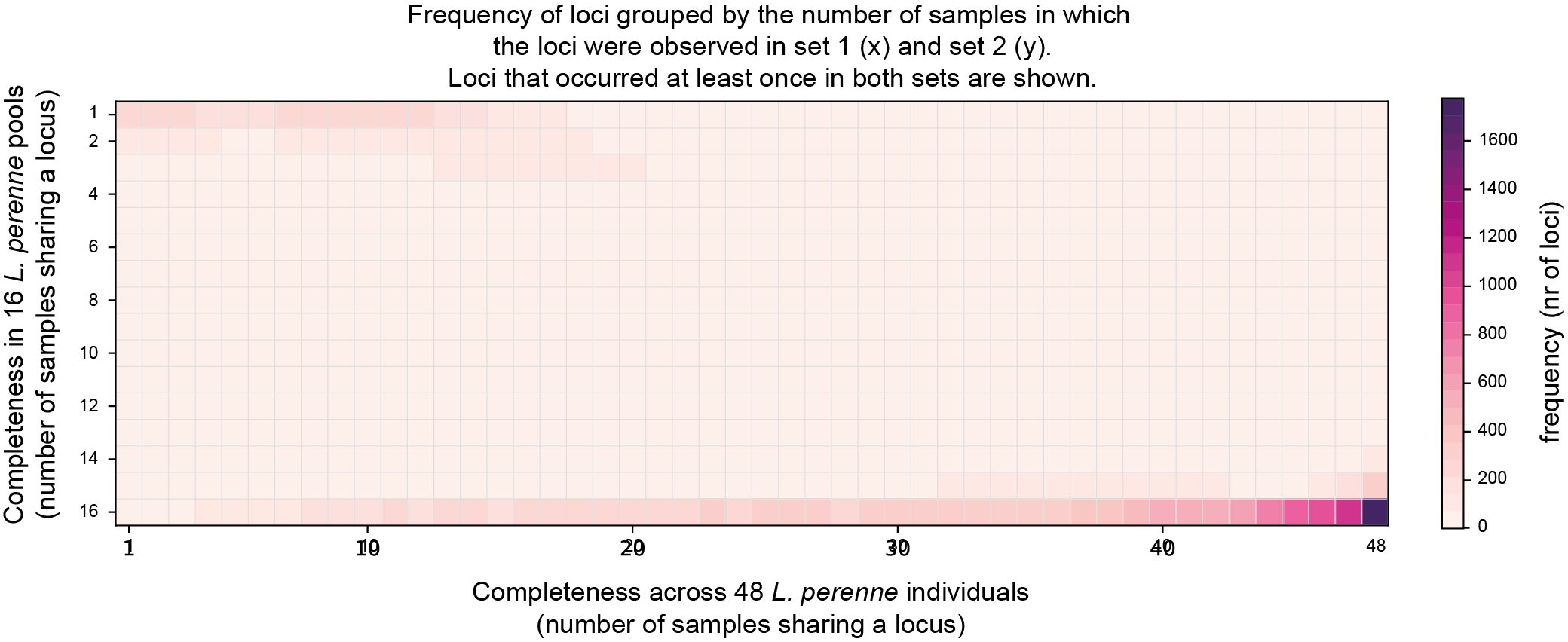
SMAP compare will plot four heatmaps. The top two heatmaps show the number of loci per combination of Completeness scores in the two respective sample sets. The position in this Completeness score matrix defines in how many samples a locus is observed in each of the two sample sets (Set1 on the x-axis, Set2 on the y-axis), the color in the heatmap shows the number of loci with this combination of Completeness scores.
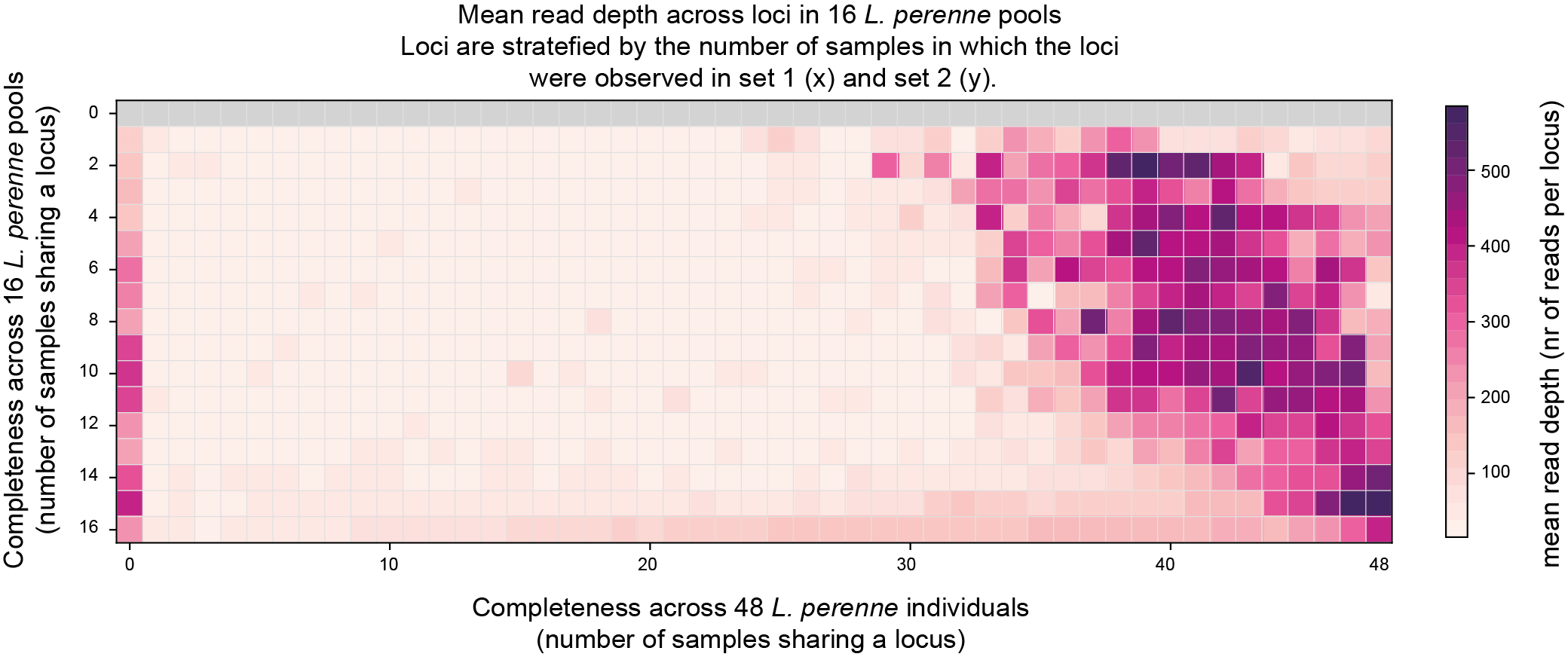
Two heatmaps show the mean read depth in the same Completeness score matrix (one plot per sample set).
Completeness
The first two heatmaps allow to evaluate the expected number of common loci across two sample sets.
For instance, in this example data, Set1 contains the loci observed across 48 individuals, while Set2 contains the loci observed across 16 replicate pools of these constituent individuals.
The first heatmap shows that most loci are observed in only one of 48 individuals (Completeness `1´ , left-hand side of the graph), showing that the vast majority of GBS fragments is unique to a single individual.
The heatmap further shows that these same loci are never covered by reads in any of the 16 pools (Completeness `0´ ), despite being created from the same 48 individuals, revealing the bias against low frequency (MAF 1-2%) allele observations in Pool-Seq data.
Conversely, the lower-right corner of the completeness matrix shows that the loci that are commonly found across all replicate pools (Completeness near `16´ on the y-axis), are the same loci that were also commonly found in the individuals (Completeness near `48´ on the x-axis)
The first heatmap shows the Completeness score matrix, including the non-overlapping classes (`0´ , observed in one set but not the other set).
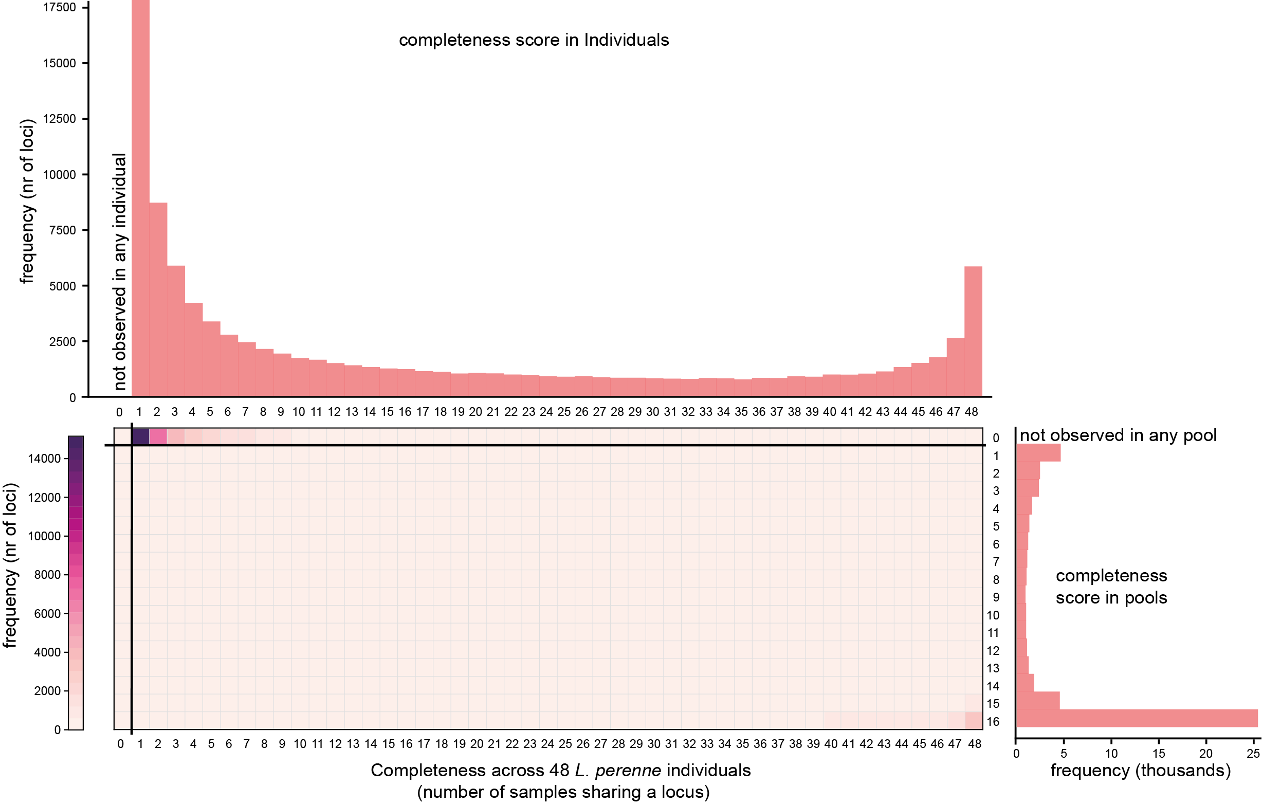
Below, the completeness graphs originally obtained with SMAP delineate per sample set are shown at the top (Set1, individuals) and right hand side (Set2, pools) of the SMAP compare heatmap for comparison.
The second heatmap shows the Completeness score matrix with only the overlapping classes. Note the difference in the (false colour) scale that is adjusted to the total number of common loci in the two sample sets.
Read depth
The last two graphs show if sufficient reads were mapped per sample set. These data can be compared to the saturation curves (saturation curves) obtained after running SMAP delineate.
The third heatmap shows the mean read depth per locus observed in Set1, across the Completeness score matrix.
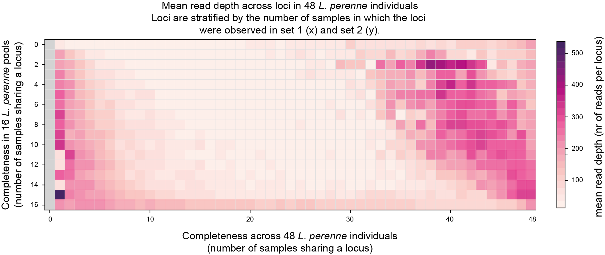
The fourth heatmap shows the mean read depth per locus observed in Set2, across the Completeness score matrix.